Baskin robbins kiosk is a product designed to give consumers
a positive experience of the brand when ordering non-face-to-face
by imagining the impression of the brand.
Even when ordering from the kiosk, we wanted to convey the original impression and experience of the brand.
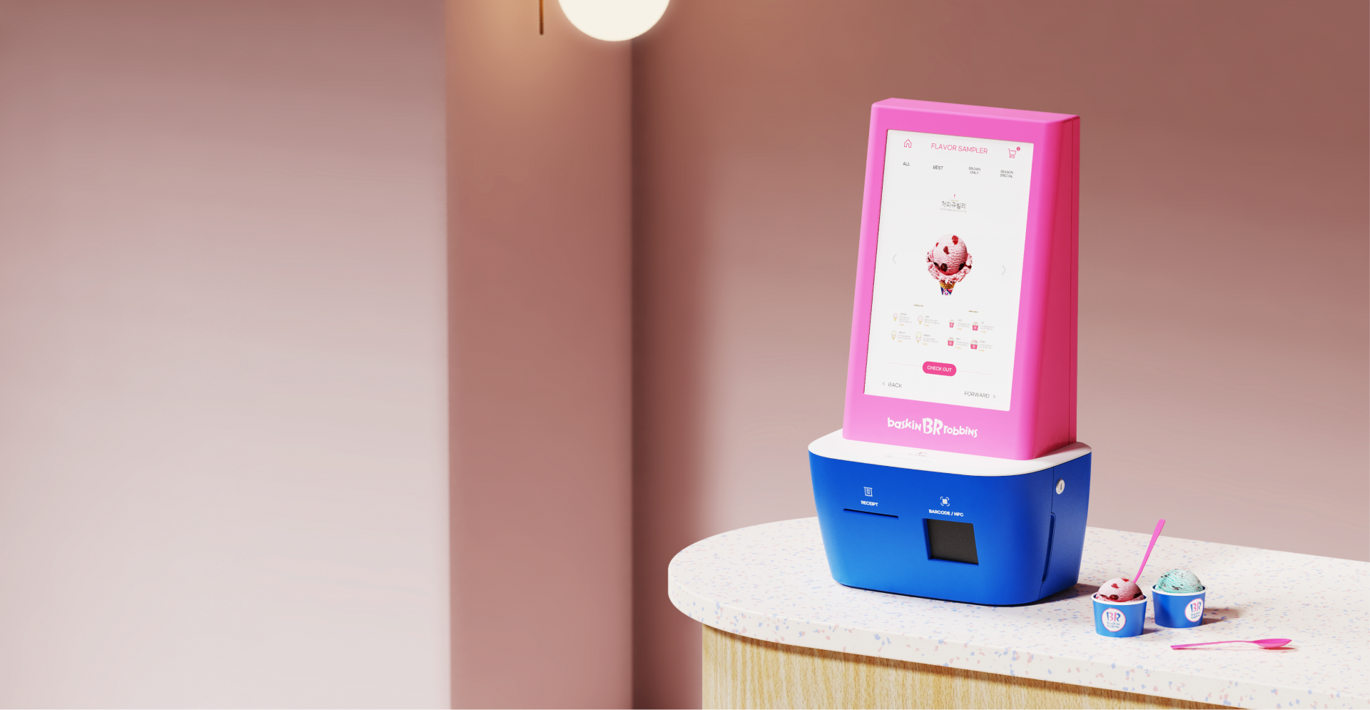
Baskin robbins came up with the concept of ‘tasting a bite with a pink spoon before ordering’ to encourage
ordering of the newly launched ice cream, and the pink spoon has become a symbol of Baskin Robbins.
Choosing and scooping ice cream with a pink spoon is a positive experience and identity unique to Baskin robbins.
We wanted to make consumers feel this part of the kiosk experience as well.
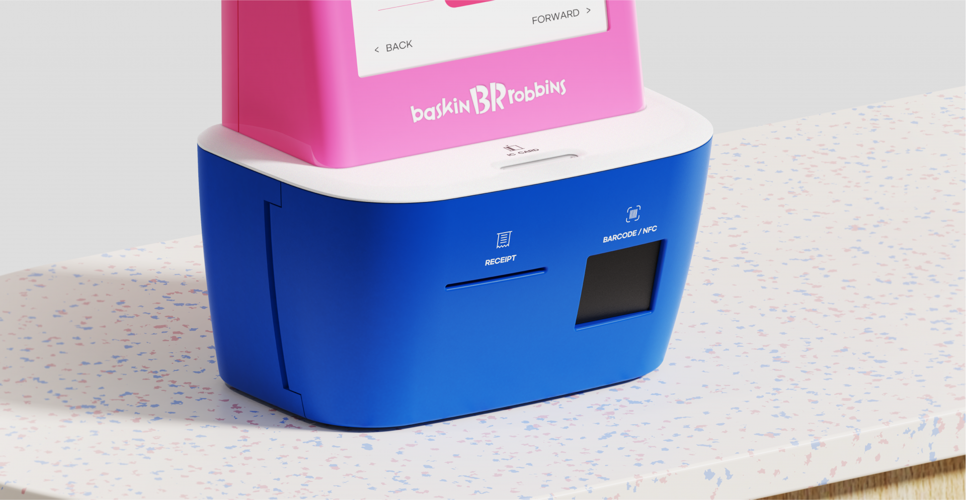
By shaping the product so that consumers are reminiscent of the action of inserting a pink spoon into an ice cream cup
when using the kiosk, we wanted to remind them of the experience of tasting a bite before ordering,
and raise expectations about putting the selected ice cream in a cup.
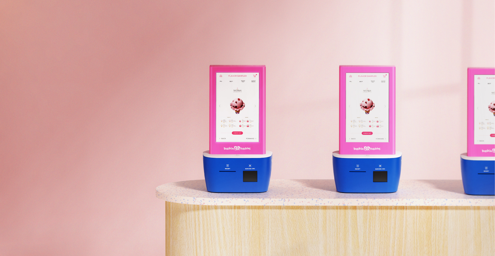
Through the new kiosk design, Groom Design hopes that non-face-to-face ordering will be a pleasant
and memorable experience for Baskin robbins consumers, rather than an inhuman and cold experience.